Rethinking GeneCards: A UX Experiment in Scientific Software Design
Nov 18, 2025
GeneCards is one of the most valuable genetics resources we have for research scientists. A single page that brings together everything known about a gene: expression, function, pathways, and even purchasable reagents.
As a product manager with a background in genetics, I found myself asking: valuable for whom? The resource seems encyclopaedic, but without a standout use case. It’s brilliant as a database, but overwhelming to use. Each gene page is essentially a 40-page plus scroll. The information you need is likely there, but how do you get to it and how do you interpret it?
The tension between information and usability is exactly the kind of problem I love to explore. It is one I see so often in scientific software.The first iteration of a product is treated like the final version. Often these tools are a demonstration of the author's prowess owing to our culture of publication being currency. The tools may not necessarily be focused on the main user persona. So, as a thought experiment, I decided to redesign some parts of the GeneCards interface for the purpose of Drug Discovery scientists engaging in target- identification and validation.
The Problem I Saw
GeneCards presents information without context. It’s not clear who it’s for:
The pathway section suits a systems biologist.
The genomics section feels designed for a bioinformatician.
The products section appeals to lab scientists.
All of it lives on one enormous page. For a user who just wants to know “what does this gene do?”, that may be an intimidating experience.
Cognitively, the user is juggling multiple mental models, jumping from GO terms to phenotypes to pathways, without guidance or hierarchy.
My Approach
I began with a simple use case:
“I want to understand what this gene does.”
From there, I identified the five most relevant sections:
Gene Summary: the plain-language description of function
Function: deeper GO terms and descriptions
Phenotypes: what happens when the gene is disrupted
Pathways: biological processes involved
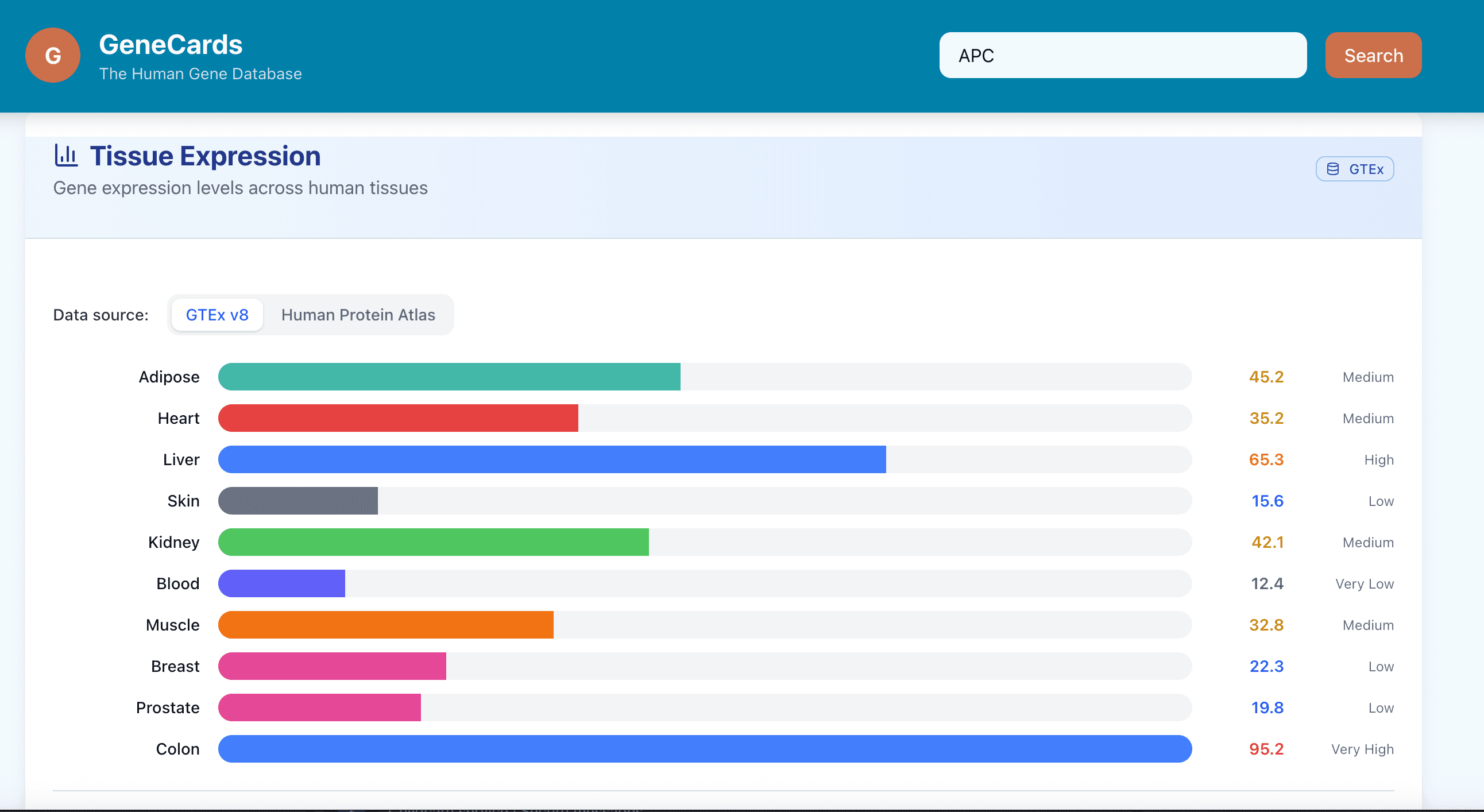
Expression: where the gene is active
In my redesign, these appear together in cleaner, scannable cards at the top of the page. The deeper technical content moves into tabbed sections for each user type (researcher, bioinformatician, lab scientist).
This alone moves the experience from data hunting to knowledge discovery.
How I’d Approach a Redesign Like This
If this were a client project, here’s how I’d structure it:
Discovery & User Interviews
Identify who actually uses GeneCards and for what purposes.
Many scientists use it to understand gene function, not for reagent ordering or variant data.
Problem Definition
Pain points: information overload, unclear grouping, and high cognitive load.
Users report “scroll fatigue” and uncertainty about what’s most relevant.
Prioritisation
Rank sections by user value.
For the “understand gene function” use case, the top five sections (Summary, Function, Phenotypes, Pathways, Expression) take priority.
Product Requirements
Draft a Product Requirements Document with clear user stories and acceptance criteria.
Example: “As a translational scientist, I want to understand a gene’s role in disease in under two minutes.”
I would deliver the PRD to the client for review.
Prototyping with AI Tools
Use design-AI tools to quickly generate first-pass mockups and variants.
Apply manual tweaks or AI command line interface refinements before sharing with stakeholders.
Engineering Handover
Deliver the PRD, annotated prototype, and notes on modular structure for future expansion.
Delivery Planning
Define a two-week Minimum Viable Product sprint for the top “gene card” redesign.
Defer optional features (personalised views, dynamic search) to later iterations. Providing a short roadmap.
Delivery & Feedback
Release to a small user group. Measure:
Time to key information (baseline vs redesign)
Scroll depth and click path simplification
Qualitative feedback on clarity and satisfaction
Iterate and Adjust
Review early results. If needed, reduce scope to ensure a working version ships and generates learning.
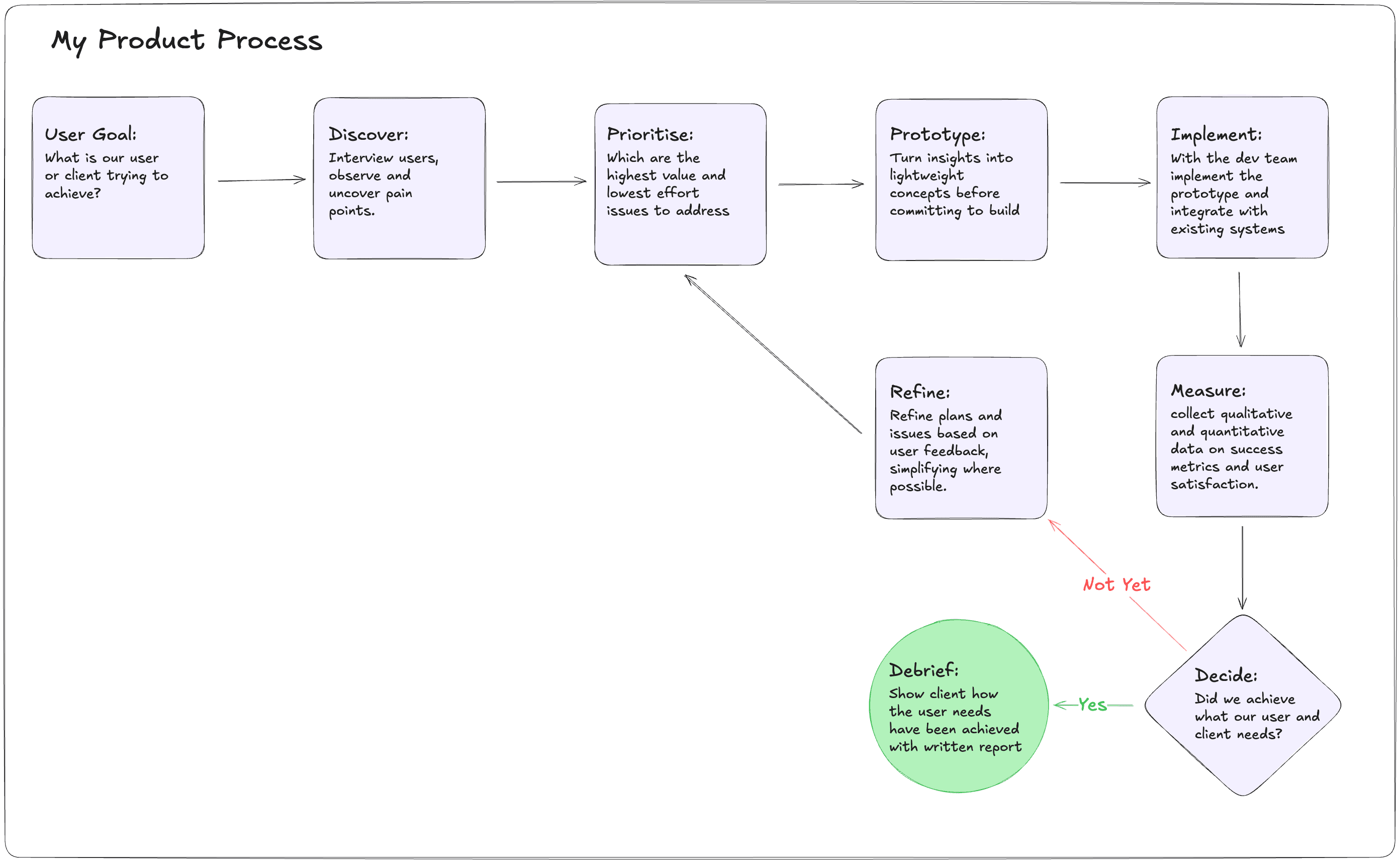
Here is the workflow I use in a client facing engagement. This is what you could expect from me.
How does it look?
Here you can see the change between the current genecards layout and the modified redesign.
Above is the current genecards UI. It shows a very comprehensive view, albeit challenging to keep track of.
Here is the modified genecards site. While it only shows a small snapshot of a gene view and how we could organise the information in a less overwhelming way, this exercise shows how we could explore alternative designs that may better serve the user by combining UX research with AI prototyping tools.
Reflections
This isn’t about redesigning GeneCards per se, it’s about what it represents and how as an industry we could improve the experience of our scientific users with some Product Sense and Design Thinking to adapt the software to the needs of the user.
Scientific software often falls into a trap: it’s built for sharing data, not using data. We can see this in genecards, gnomad, and even the OpenTargets platform. The implicit culture says, “If you have a PhD, you should know how to use this.” That mindset stifles learning, creativity, and collaboration.
The truth is: if an interface is unintuitive, it doesn’t matter how powerful it is. Users won’t use it, and as Product folk it is our responsibility to enable people to use these powerful knowledge tools.
AI and modern web frameworks now give us an incredible opportunity to design tools for the scientist, not for the database. We can tailor experiences to workflows and let users focus on discovery rather than deciphering the UI.
This small “toy” redesign is my way of exploring that idea; how even subtle UX changes can make complex science easier to navigate.
Closing Thought
In an earlier post, I wrote about the trap in scientific software; the urge to build something complicated and impressive, when what users really need is something useful. Often, that also means something simple.
We shouldn’t expect users to figure out our tools. Our job is to aid them.
In this example, I’ve shown how we can redesign a well-known scientific website around a clear use case and create something hopefully more usable, more pleasant to use, and I did it quickly. From here, we could test, learn, and iterate again.
If your organisation relies on internal tools that are powerful but hard to use, I help teams redesign them around real workflows, turning “data platforms” into products scientists actually use.
Get in touch if you’d like to explore what that might look like for you.